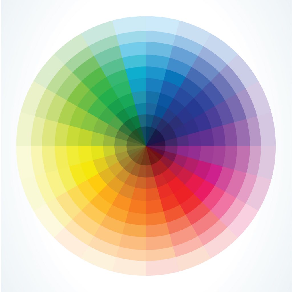
Without any doubt, colors are the foundational building blocks for every interface design. Around the bend it comes with a striking color scheme which might seem a difficult task, especially if you are not too deep into graphic designing.
However, in reality it turns out as an entire easy process. Once you are attentive to practical techniques and tips, things become even more convenient. So, this article is all about making you understand on how you can select appropriate colors for UI design and where you can find the best color palette for your website, and better product user interface.
Overview
Creating a color scheme for a product might seem like a hard task (especially if you do not consider yourself a graphic designer). But in reality, it is not as complicated as many people think. It only takes 60 seconds for a user to rush into judgement of digital product.
Bizarrely, for us as a web design agency in Boston MA , most of the judgement is based on color. And there are quite a few tricks on how to choose colors for website, how we can create great color scheme in no time with some handy color palette tools .
Best Colors For App Design
Finding out the best color palette for your app could be considered the most important part of an every application visual designing. Nevertheless, selection should not be entirely based on over complicated assumptions. Once you start designing a new interface, you have to keep the following color palette design elements in your mind : most importantly, user demographics, the use of product, and the company branding guidelines if any.
Begin With A Product Objective
The objectives of your app designing should be clear enough to your client and their users. The brand value, your client would like to portray when describing the product is the beginning path towards your main mark. Moreover, there are some guidelines that must be in parallel with choosing the color scheme.
- Your App should be reliable. It should be designed in a way of consistent good quality or performance.
- Your App should be structured in a way that it should look well-built and stable.
- Your App should be related to or connected with some sort of professionalism that shows how professional app developer you are .
- Your App should be fresh and modern that follows all the designing trends of 2019.
These are some important things you should consider. You can also jot down the list of tasks to make your app more robust and user-friendly. However, more importantly, selection of the primary color is the most pivotal part of app designing that requires more than normal consideration. The base color you would choose for your app would help you in branding and ascertainment.
Choosing the Color Scheme

Every individual responds differently to every different color. However, one-purpose built app users have almost the same favorite colors that evoke the hyper-specific emotions in them. These colors become influential for the user to decide if they want to download and have experience with your app. You can expect the audience to love your newly built apps but every one’s personal taste, life experiences, cultural considerations and niche interest response can be different. You may do a survey and look for your competitors app if they have something that really caught your attention as an apps designer. Follow their technique , don’t copy.
Let’s say designer used saturated red color palette that triggered your emotion and passion in response to that app, not to mention, these kinds of statements are not scientifically proven. It’s all about how you perceive the color and its impact on you.
Similarly, think of your audience, when they will see your app how would they react to your app color choice? If you are creating a medical app, you may use the blue and red saturated color scheme, while for grocery app, you may prefer green or yellow color as the primary color and if you design a beauty app the primary base color would be pink, red or black. It is not necessary, but this is what users of your app would expect from you. Consider the purpose of the app, choose the primary color after doing some research and then begin with the designing.
Avoid too many colors combinations in one app, limit the color palette number from 1 to 3 that the user finds it clean, well designed and perfect app of their interest. Needless to say, 1 or 2 primary colors with 1 accent color along with range of subtler shades of gray, blue and green. At every step of the app, it should clearly convey the information and hierarchy ; size , font, proximity, layout etc. to the user.
Saturated Palette Colors
Both less and more saturated colors work best for the apps. More the color saturation, more would be the attraction of user towards the app. Contrary to this, less color saturation will help the users to focus on thought-provoking tasks, whereas, the strong colors are used to complete one main function.
Apps like Uber, and Airbnb used one saturated color and other less or desaturated colors to make their users understand and act accordingly. After observing number of such successful apps, you would come to know that highly saturated colors bring visual fatigueness in the user’s eye. Therefore, prefer some shades of gray to prevent them from eye strain. If you use bright yellow as a base color, then use the desaturated variation of primary blue and gray color to build a strong tonal coherence.
Creating A Palette

Although, a number of traditional ways have been used to find the perfect palette color scheme, but one that really works best for every designer included-
- Adjacent – Pick a base color and select the next color to it in the color palette.
- Triad – Draw an equilateral triangle over the color wheel.
- Shades– Pick only one base color and then different versions of different saturated color palettes.
Don’t only select the colors,adjust them around and find which color works best for your app. Because there are some best color combinations for websites, but those colors don’t carry that much value on mobile app as on desktop app. Therefore, it is better to do some more homework on experimenting the colors on the monitor, laptop and mobile device and then choose wisely.
22 Best Handy Color Palette Tools
Below are the 22 handy tools that will help you select the perfect color palette for your project.
- Coolors – Allows you to make a color palette based on the colors found in the image you uploaded. Available for Android and iOs.
- Colourlovers – Allows you to select massive user-generated colors and palettes.
- Dribble Color – Allows you to select a primary color and find palettes that work best with it.
- Materialpalette – A basic material-style tool used for designing android apps.
- Adobe Kuler – An official adobe tool that allows you to play around with color wheel or upload an image while it generates best color schemes for you.
- Pictaculous – Tool that works only with images to generate palette color scheme.
- Collor– Allows you to generate the color palette tints, tones only from the color you opt from color pickers.
- Paletton – Allows you to display similar shades of one base color you choose for the layout.
- Palettegenerator – Allows you to upload at least 20 images for color palette creation.
- Color Scheme Generator – Allows you to create various color combination schemes such as triadic, split or double complementary on the basis of primary color you choose.
- Palettr – Allows you to view the photographs with color schemes once you have uploaded them on tool.
- Color Wizard – Allows you to generate color scheme with variations in saturation, tint, hue and shades based on the color you select.
- Colorotate – A 3D tool for generating color scheme from the predesigned color palette you choose.
- Color Blender – A perfect tool for generating color schemes with shade transitions in two colors.
- Paletton – Allows you to select the primary color and play with more than 5 additional tones.
- Adobe Color CC – Allows you to use a color wheel for creating color scheme that can be exported into Adobe Photoshop.
- Mockplus – A great prototype tool that allows you to build an ideal UI design.
- Canva Color Tool – Allows you to learn everything you need to know about the colors and facts about how they are blended.
- Color By Hail Pixel – Allows you to generate color swatches.
- Colorschemer – Allows you to set HEX and RGB codes in toolbar to generate the color scheme.
- CSS Drive – Allows you to add the URL to generate color codes and color scheme.
- COPASO – Allows you to generate rich color palette and published it by giving it a name.
Conclusion
Above mentioned color palette tools with great functionalities are need of every designer. These tools have made our life easier and also made us proficient enough to decide which color scheme would be best for our clients’ apps. If you want the true uniquely designed app from the best web design company in Massachusetts, then look no further-just give a call at (888) 355-8880 and get the best apps designing and development services.