Long-form content marketing is the key to win according to the latest SEO techniques. The expert has shared this secret tip that how the long blog posts will help you to get leads and how they are the reason behind the inbound marketing success. But in this blog, we will be focusing on the UX element that will help you to grab the attention of your users. The following UX web design tips will support your long-term content assets and it will ensure that your user is engaged properly when reading the content.
Let’s get started:
1- Appropriate Usage of Schema Tags on Website

The purpose behind enhancing the value of your long-form content is to make your web content structure better so that the right audience can see it at the right time. We are aware of the fact that Google gives priority to in-depth content in the search engine result pages. Furthermore, you can use specific markups to ensure that search crawlers properly recognize your in-depth material.
Schema.org article schema markup
Schema markup Authorship
Rel=next and rel=prev for paginated articles.
You would have worked hard on your content now the above steps will ensure that your content is viewed by the right people.
2- Pairing of Text and Image
It is a fact that you will add relevant images in your long form content. Your text and image side by side makes your content engaging and attractive. This strategy will increase information retention from 10% to 65%. You might have a question in your mind that how the pictured should be added to make them attractive instead of distracting? Furthermore, to eliminate all the problems. You can get in touch with a professional company to avail the UI/UX web designing services from the experts.
You have to synchronize your text with the image. It is very important to know what type of images you are going to add. If you are just adding the stock images, then this will not be enough. Remember that images are nothing without their supporting text so you need to add a helpful visual element that will reinforce the value of your text. Some of the options are listed below:
- Graphs, charts, and tables will help the reader to visualize data trends.
- Infographics that present multiple data points in a single image.
- Drawing or example photo to illustrate abstract concepts.
- Supporting videos to explain and outline the key concepts. This practice will be good for complex topics.
The primary goal here is to ensure images have some purpose instead of just a picture in your text. In addition to this, the other detail that matter is how many pictures you are going to add? Placement of image relative to the existing text and white space? Generally, if you ensure that all images are relevant, then you will already be leaps and bounds ahead of other content producers who rely on the stock photos.
3- Proper Use of White Space
In terms of designing, white space is the area that is not used by the text or images. It is very important to understand how you are going to use white space in design and it is very much essential for your long-form content.
The importance of white space can’t be ignored as it adds an important buffer to your articles. For your information, the huge text blocks are not easy to read. So, it is important to break up the text using appropriate white space. With this, your user can easily read the text.
4- Give Priority to Mobile Experience

Majority of the readers will prefer to use desktop for reading the long form content but you can’t ignore the fact that some will prefer to use their mobile as well. According to a report, a US adult spends over 3.5 hours per day on their mobile devices. In the future, we will see that this time will increase.
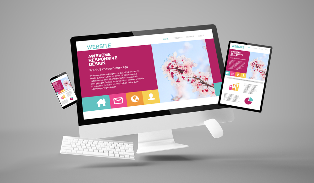
You need to work on your mobile responsive design for accommodating the long-form reading. You need to take into account the text size, screen size, and the length of the post. Remember that the visibility issues regarding typography and white space are bigger concerns on mobile as compared to the desktop.
You should focus on the simplicity and legibility to make your content easy for consumption. If you are working on your adaptive content strategy, then you need to work more and take advantage of it.
5- Adding a Visual Progress Bar
When we are talking about the UX, then it is all about facilitating our audience. By adding a progress bar on the website, you are telling your reader how far he is from the end of a blog. The long-form content is more of a commitment from a reader’s perspective as compared to the short blogs. Either the reader is getting to the details or read word by word, the length of the in-depth content can be intimidating.
Keeping this in view, it is very important to understand what we are getting ourselves into ahead of reading the blog. Due to this reason, website like Medium has added “X Min Tag” at the tops of their articles.
Having the visual anchors helps support information discovery for readers who are just scanning the content. If they are just going through the blog, then it is very easy for them to navigate with the help of a progress bar.
Conclusion
The concept behind the UX design is to make our lives easy. As discussed above, long-form content is more of a commitment from readers and UX improvement you are going to make will add more of an impact here as compared to short blogs. You should keep these tips in your mind to ensure that you are paying attention to your UX design to make your text readable and valuable.
Looking to connect with an experienced company to make your website UI/UX better for your audience? You need to contact TopNotch Innovative Technologies, a web design company in Boston to hire the skilled web designer. They will provide you the best solution to enhance the visual appeal of your website and will also make it user-friendly.